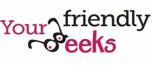
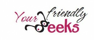
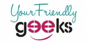
So, this “despirately – disperately – desparately”seekingwp.com domain name has been a bit of trouble in the spelling department. And its ridiculously difficult to spell over the phone.
As much as I love Heather – (in fact the domain name was why I started reading her blog – how can you not feel a kinship with someone desperately seeking sanity?) – I’ve purchased a new domain name to go with my tagline: your friendly geeks.
Now, comes the difficult part – re-branding! Dianne and I put our heads together and have some options. But I want to know what y’all think.
Which do you like? But even more helpful – will be if you can explain WHY you like it?
Thoughts? Critiques?


I vote for earth color distressed or tri color smile. I think the others are a teeny bit hard to read, but I love these other two…I think the smile might be my fave!
I was wondering about that too – I dont want it to look like “your friendly EEK” lol
I love the grey and green. The colors are comforting and the fonts seem cheerful. Pink turns me off, it’s just a little too bright. And pink. But the grey and green just makes me happy.
No pink? How can you not like pink??
I like the grey and green too!
Very creative! I do like the first one, but the tri-color smile gets my vote!!
I like the one with the orange (earth color distressed thingy), because I like orange On the other hand if the orange is gone and I have to choose again, I’ll choose the tri color because it reminds me of Cathy’s smile hehehe
I almost NEVER choose “orange” but I like the earth color one best.
I definitely prefer the earth-color distress logo. It’s by far the most readable.
I’d suggest one tweak though: change the lower case “k” to a small uppercase one (like the “G”). That’ll give you a cleaner line between “Your Friendly” and “Geeks,” instead of having the top part of the “k” and the tail of the “y” so close together.
Thank you so much for your tips. I’ll definitely take that to the designer!